
Cannabis Email Service Updates Will Impact Email Marketing (Feb 2024)

In this article
Like your website to your greater internet presence, your logo is the foundation of your brand’s “visual system”. The logo sets the tone for this visual system, informing the selection of complementary fonts, colors, imagery, patterns, and graphics that will ultimately become synonymous with the mission and values of your brand.
When clients begin the design process here at CannaPlanners, they are often in the woods when it comes to logo ideas and direction. Knowing some of the key factors behind great logo design, and having an understanding of the 5 most common types of logos is a great way to get you started on choosing a beautiful and functional logo for your cannabis brand.
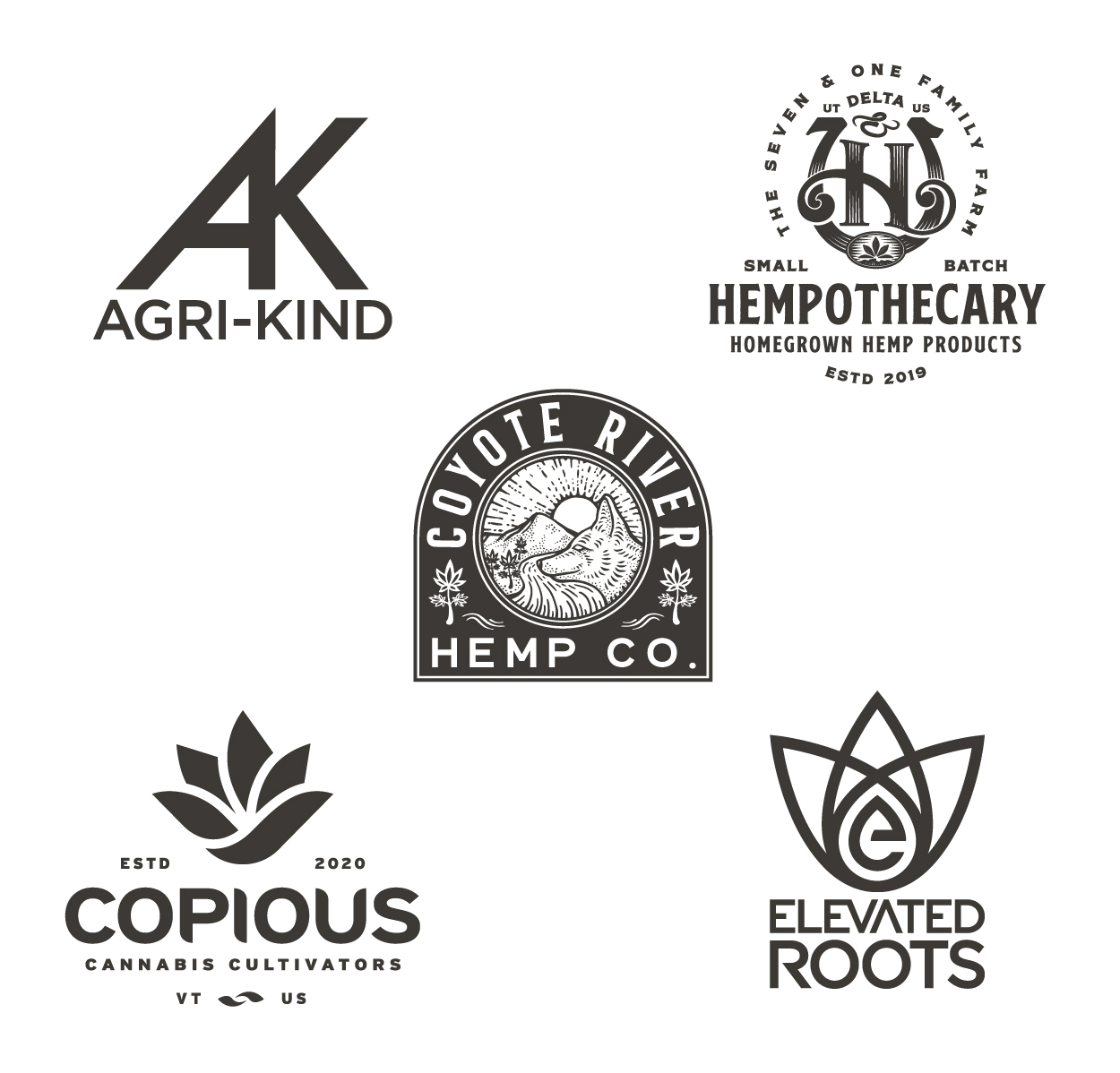
Apple’s Apple and the Nike Swoosh!! These symbols are extremely recognizable and, well, iconic. Minimal and memorable, each symbol stands as a core element of the brand’s visual system, with no need to see the company name alongside. Over time, the relationship between brand, symbol, and wordmark can become inseparable, eventually allowing the symbol to say it all, all on its own. We set out to build brand recognition for our clients by providing the right toolkit, including considerations for unique symbol creation, wordmark treatments, and functional logo lockup combinations.
![]()
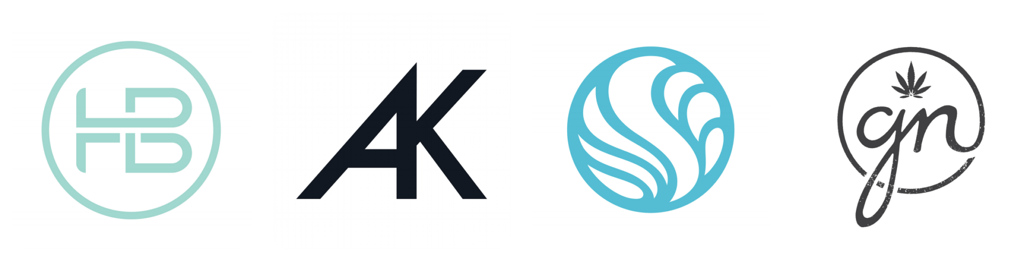
Monograms, lettermarks, or letterforms consist of one or more letters, styled and sometimes combined with additional symbols, elements, and treatments to create a unique representation of your brand. Brand name initials or simply a first letter work best, enhancing brand recognition when paired with a complementary wordmark, like Chanel and the interlocking C’s or DC Shoe Co combined with the super-tight interlocking DC + star.
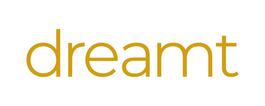
Also known as logotypes, wordmarks consist of a unique text treatment of the company name and can make a great standalone logo. Think FedEx or Coca-Cola. However, standalone wordmarks are not for all businesses. Structural considerations, i.e. the number and shape of letters in your company’s name, may limit aesthetic options, thereby compromising legibility and ultimately negatively affecting brand recognition. So, we recommend pairing up a nice wordmark with a beautiful symbol or monogram for maximum functionality, as in the next example.
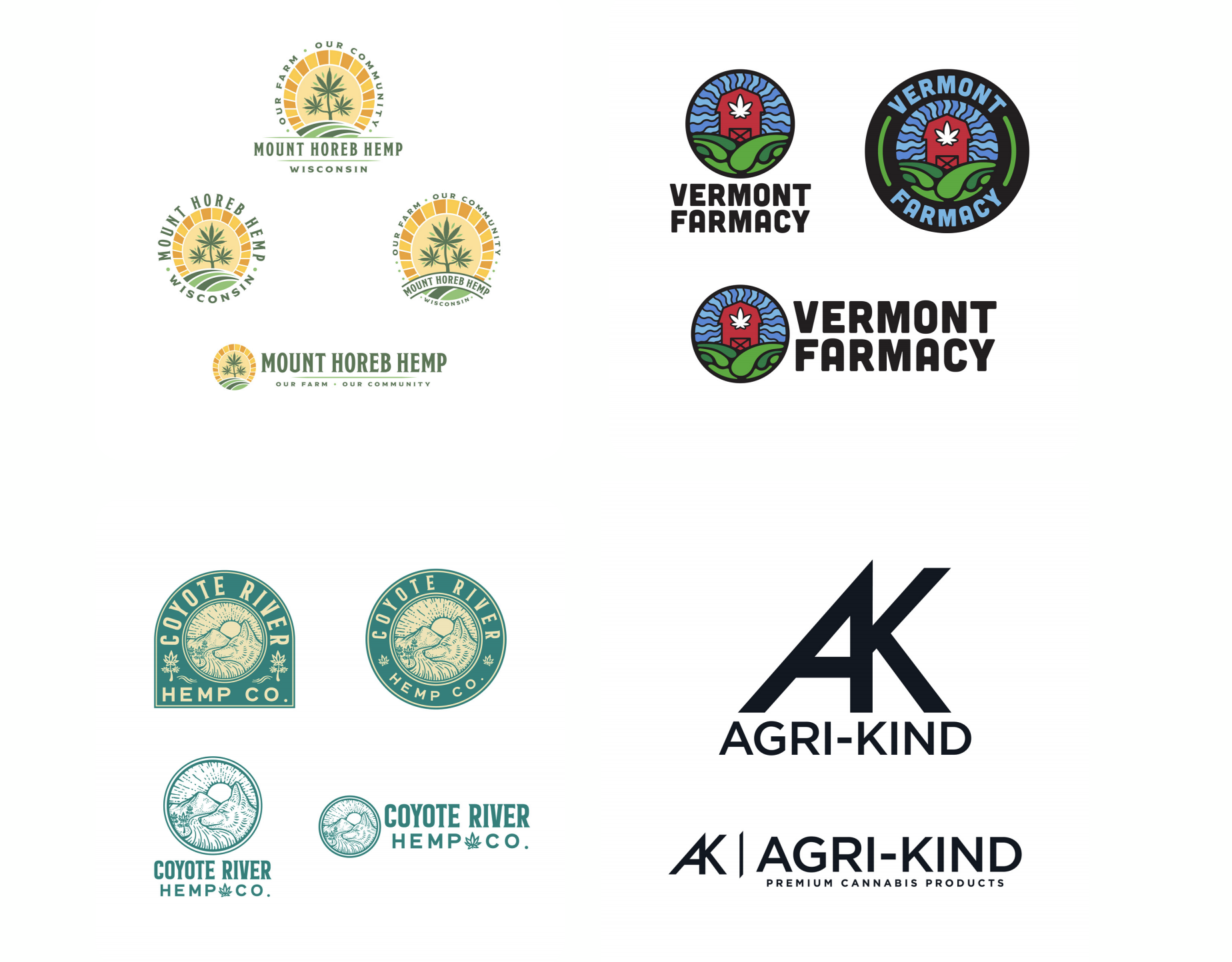
Just what you might think, combination logos marry wordmarks and symbols or monograms. Adidas + stripes (or flower!! That’s right, two symbols for this brand), PUMA + Puma, are great examples. Combination logos can be developed into a comprehensive logo collection, including different arrangements of wordmark and icon, i.e. stacked, horizontal, round, or badge form compositions. Developing a logo collection in this way ensures that a brand’s visual language is consistently conveyed across the many web-based platforms as well as in print and packaging applications.
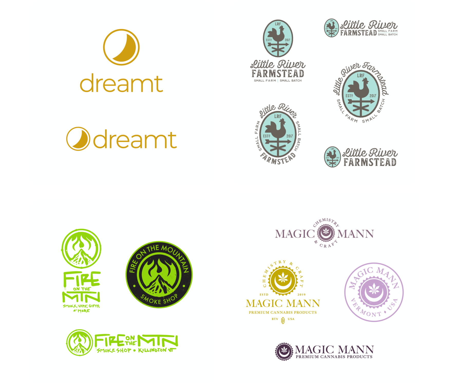
Emblems or badges are like combination logos but rolled entirely into one visual. Think Starbucks, the NFL logo, the crest for Harley Davidson Motorcycles, or the UPS shield. These designs can be simple and abstract or highly detailed and ornate. You can imagine an emblem being stamped in hot red wax to seal a letter back in the olden days of warring clans, nobility, the pony express… you know, before email and antivirus software.
Curious about some of the brands we’ve referenced here? Click through the links below!
This is a lot. We know! But do not fear, we’re here to help. In fact, we thrive on the challenges of functional logo design, doing our best to provide the tools you need to be the brand you want to be.
Click the link below and fill out the quick form so we can get in touch with you ASAP!
CannaPlanners © 2024


