There’s a definite method to your site sanity. Which is why we suggest setting up your homepage, first. Choosing your sites header and logo placement as well as settling into brand colors + fonts will prime you for success. Once the palette is in place, the rest is down hill.
Hero Image
Because your hero image is your first impression, it has to be THREE things.
It has to be a show-stopper.
It has to be high-resolution.
And it has to be the proper opacity (so that the white text overlaid on top, pops).
… … …
// HERO IMAGE SELECTION //
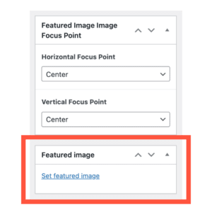
To add a hero image to your homepage, select ‘Edit Page’ to go to the pages backend.
From there, scroll down until you see Featured Image at the bottom right.
You will select ‘Set Featured Image’ to open your media library and select your desired image.
Within this section you also have the option to choose a Horizontal or Vertical Focus Point (this more so applies to positioning on mobile than it does to desktop).
Once your Featured Image is selected, you can test it before publishing it in a Live way. Simply select the ‘Preview’ button at the top of the page. From there you will be taken to a new window with your desired Feature Image. Once you find what works, make sure to hit the blue ‘Update’ to save your changes.
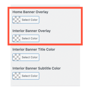
// HOMEPAGE OVERALY //
Because not all featured images work seamlessly with the white overlaid text, there’s an option to play with the overlay (on the homepage as well as interior page banners). This will darken the image and/or lighten it depending on what you need.
Navigate to the Customizer > Design Settings > Colors
From there, you will be able to select a color overlay and an opacity ::
… … …
// HELPFUL HINT //
If you don’t have imagery you adore {yet}, lean into some stellar stock photo sites. Unsplash and Pexels are two of our favorites.
Header
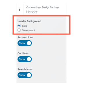
// HEADER SIZING //
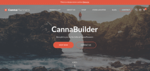
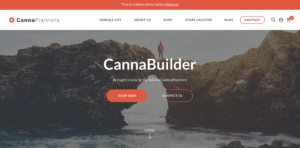
After you’ve got your hero image in place, you can decide whether or not you want it to take up the full-width of the page (Transparent) or rather display a white padded navigation bar (Solid).
To do this, navigate to the Customizer > Design Settings > Colors, like so ::
Example of Transparent ::
Example of Solid ::
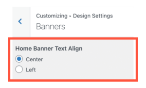
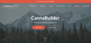
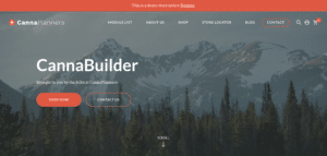
// HEADER ALIGNMENT //
Another thing you may want to do depending on what text you are featuring in your hero image {IE the name of your business, a tagline, etc} – is find an alignment that suits your needs. We have two options – Center or Left alignment.
To do this, navigate to the Customizer > Design Settings > Banners , like so ::
Example of Center Alignment ::
Example of Left Alignment ::
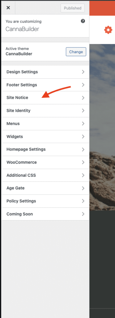
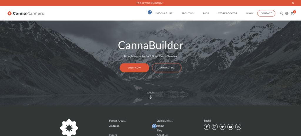
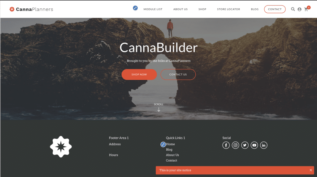
Site Notice
The site notice is a site-wide announcement that is useful for letting visitors know about important changes or promotions. You can customize the site notice easily.
Navigate to > Dashboard, Appearance,Customize. (you can also access the Customizer from the front-end of your Site using the WordPress admin bar)
Navigate to > Site Notice.
From this panel you can edit the message, and enable/disable the notice. You can also toggle the site notice position between Top & Bottom.
Site notice positioned on the topSite notice positioned on the bottom
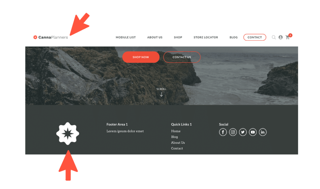
Logo
Your brands logo lives in TWO main places on your site.
The upper lefthand corner (within your hero image).
And the lower lefthand corner (in your footer).
We recommend putting a wordmark (or more horizontal logo) in the header.
And an icon (or more vertical logo) in the footer.
… … …
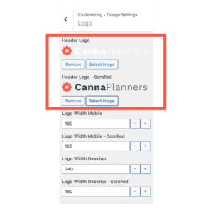
// LOGO UPLOAD + SETTINGS //
To play with your logo settings, navigate to the Customizer > Design Settings > Logos
You will find a place for photo upload as well the option to play with sizing on desktop and mobile.
Something to keep in mind … if you are going with the transparent background setting, you will likely need two versions of your logo. One that will show up on top of your hero image and another that will show up in the white space when the user scrolls down. You can see what we mean in the screenshot, below.
… … …
// HELPFUL HINT //
When scoping out how your logo will live across multiple devices, you needn’t leave your customizer. At the bottom of the customizer, you’ll see three icons. Desktop, Tablet, Mobile. Simply select the icons you’d like to see displayed.
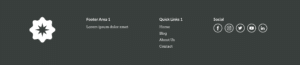
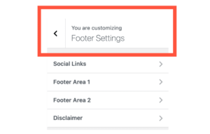
Footer
// FOOTER SETTINGS //
There are a few main areas in your footer which we can address here, but more than likely, you will revisit the footer later in the site creation process once your main navigation comes to life.
There’s Footer Area 1 (often used for Contact Information), Footer Area 2 (Often used for ‘Quick Links’ // or a site index), and Social Links.
To edit your footer, you’ll navigate to the Customizer > Design Settings > Footer Settings, like so ::
Brand Colors
The color game is a FUN GAME to play!
// HELPFUL HINT //
Because we often see folks getting into the color weeds, stick with three colors that fall within a complimentary family. Anything more gets out of control. If you’re not strong on complimentary colors, luckily Color Palette generators exist.
… … …
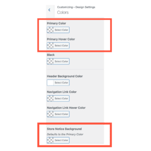
// SELECTING YOUR COLOR PALETTE //
To edit colors, navigate to the Customizer > Design Settings > Colors
Start with choosing a Primary Color, a Primary Hover Color and a Site Notice Background Color. This will give you a simple base.
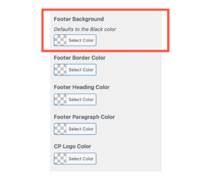
Next up, select your Footer Background Color ::
Brand Fonts
The CP Page Builder uses GOOGLE FONTS, Only.
A great way to scope out what feels right before making your selection on the LIVE site is to first browse fonts on Google.
Similar to the ‘less-is-more’ rule in the color game, the same goes for fonts.
We recommend sticking with 2 or 3 fonts at most.
A font for the Headers.
A font for the Paragraph Text.
And a font for the Navigation + Buttons.
This is UX thing. Folks eyes like to stay in a consistent environment.
… … …
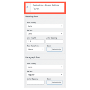
// SELECTING FONTS //
To edit colors, navigate to the Customizer > Design Settings > Fonts
Within this section is the option to play around with sizing of fonts as well.
Keep in mind the default settings are CannaPlanners best practice settings.
Buttons
Are you a square or a round person? (just kidding)
We’ve got options for both buttons on your site.
… … …
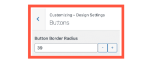
// BUTTON SHAPES //
To edit the border of the buttons, navigate to the Customizer > Design Settings > Buttons
// BUTTON COLORS //
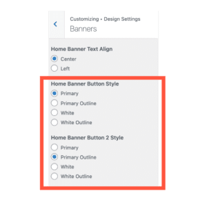
The buttons will naturally default to the primary color + primary hover color. There is no way to alter this. However, there is an option to adjust the button color display in the hero image. The option for Primary, Primary Outline, White and White Outline is available to you.
To edit the hero buttons, navigate to the Customizer > Design Settings > Banner
Site Map + Menu
Outlining the basic structure of your site before building out page content allows you to zoom out before zooming in. Trust us, the 360 degree view is the best view for embarking, efficiently.
General Site Map
Your site comes bundled with SIX BASIC pages.
These pages have a dual purpose.
First, to show you the CP Page Builder’s basic pages templates.
And second, to act as fire starters for your own content placement.
… … …
MODULE LIST – A list of all available modules used in the CP Page Builder (this page will eventually be hidden from the sites main navigation but is used as a guide post for site creation).
ABOUT US – Standard template for introducing your business + employees. Comes with a team member module and basic spaces for mission statement, ETC.
SHOP – Standard template WooCommerce Shop. Complete with category filters.
STORE LOCATOR – Standard page for store address phone number and map functionality.
BLOG – Standard recent posts template.
CONTACT – Standard contact form.
… … …
// HELPFUL HINT //
What are the 3 Main Things You want users to do on your site?
What are the 3 Main Things You want users to know about you?
As always, our philosophy at CP HQ is less is more. Best practice is to have no more than 6 top level pages in the main navigation. Start there. There’s always the potential to nest + combine pages.
Creating Page Shells
Now that you’ve got a list of pages you’d like on your website, let’s build out the shells so that we can add them to your sites nav bar.
(Side note, this is not the point in the process where we will build out the pages in completion. That comes next. Patience, Jeti.)
.. … …
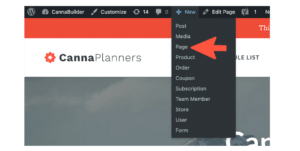
// ADDING A PAGE SHELL //
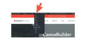
Navigate to the + New Tab in your Dashboard’s top black bar
You will have the option to select Page
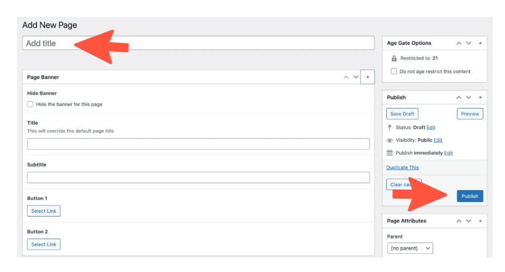
Next you will be in the general page builder.
What we are going to do in this step is ADD TITLE to the page and press UPDATE. Easy peasy.
Repeat this step for the additional pages you are looking to create.
Menu Assembly
Now that we’ve got your page shells created, we are going to assemble the menu so that your pages display in the main site navigation in the order you would like.
… … …
// ASSEMBLING THE MENU //
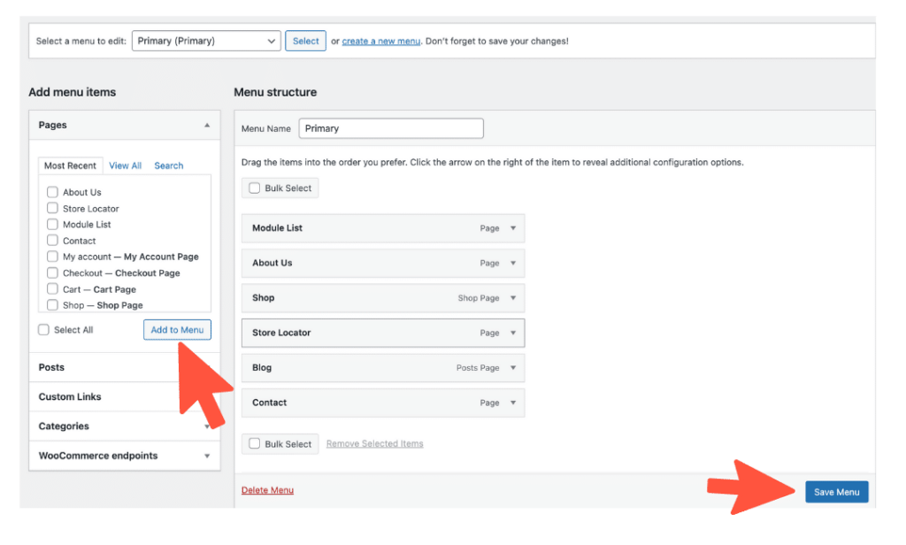
Navigate to > Dashboard, Appearance, Menus
When you land on this page make sure the Menu Name reads :: Primary.
You will see all the Pages on your site on the left and the Menu Structure on the right.
To add additional pages to your Menu Structure, you will simply select the page you’d like to bring into the main sites navigation and select ‘Add to Menu’ (highlighted below).
From there your page will populate in the structure and you will have the ability to toggle it up down and or nest it under other pages.
Page Creation
Our builder is composed of 18 MODULES.
Because each module comes with variations (choice of color, font, width, and so much more), there’s an INFINITE number of ways to stack, build, and create!
And to view a basic run-down of the modules + how they are used, click HERE.
Setting up a Basic Page
Because we’ve already set up the Homepage shell as well as the interior page shells, we can start on any one of those pages to begin.
For the sake of ease, we recommend starting with the Homepage, first.
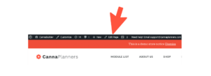
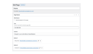
You will simply navigate to the black bar at the top of your site and select ‘Edit Page’, like so ::
From there you will be taken to the pages backend. Each page has the same page builder structure.
// PAGE BANNER //
At the top of each page you will see the Page Banner.
Within this section there is space to Title/Subtitle your page as well as add 1 or 2 buttons.
There is also the option to hide the banner altogether {e often do this for blog pages and/or shop pages where the name of the page is not necessary}.
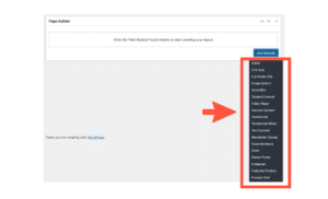
// PAGE BUILDER //
Once the banner is in place, scrolling further down the page will take you to the page builder.
From there, you will click on Add Module and have your pick at the 18 modules.
Once selected, you’ll have the ability to toggle each module in the order of your choosing.
Lab Results Page
Creating a Lab Results page is a cinch!
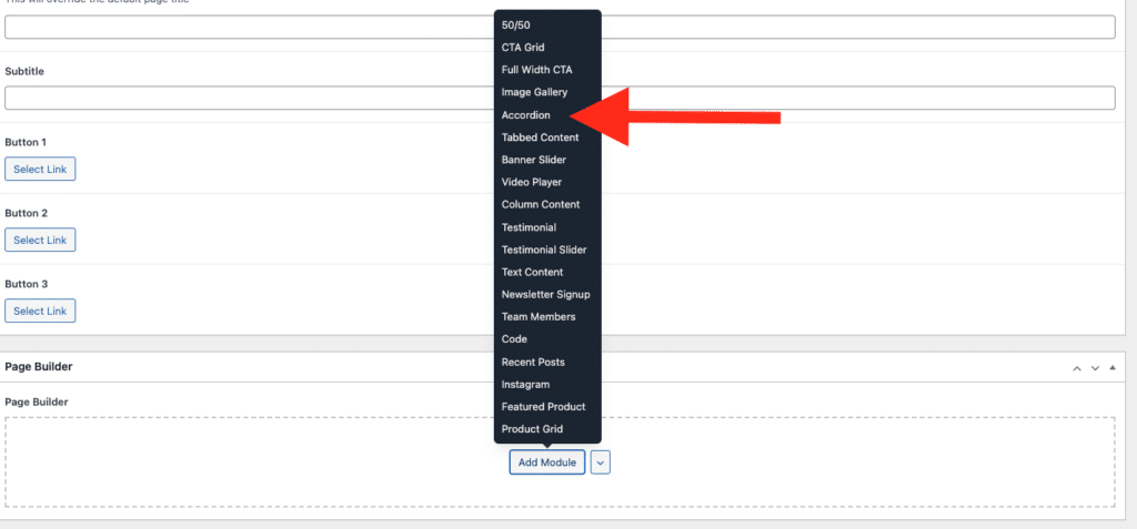
Firstly, you’ll need to create a new page and title it Lab Results.
To do that, navigate to Dashboard > Pages > Add New Page.
From there, you’ll want to scroll down to the page builder and select the accordion module, like so ::
Next, give the title of the accordion a name.
(IE Certificates of Analysis OR Flower // something that is descriptive for the lab results that will be nested underneath)
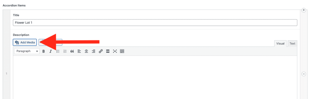
Once the title is in place, you’ll begin to enter in the actual results.
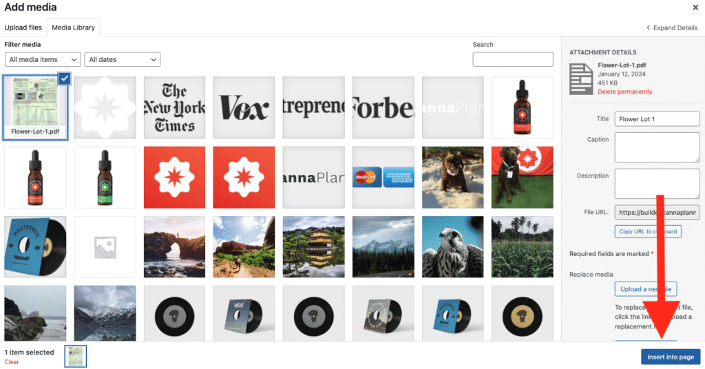
First enter the name of the results. (IE Flower Lot 1 as shown below)
Next, you’ll want to click the Add Media button.
This will take you to your media library (where all of the media on your site lives).
If you haven’t already, drop the PDFs of you Lab Results into your media library.
You’ll want to select the appropriate media file and click insert into page, like so ::
Once, inserted, the media that was selected will appear in the description box.
(Helpful Hint :: make sure the naming conventions of your Lab Results are user friendly!)
That’s it! You’ve done it.
Follow suit for the rest of your lab results by selecting ‘add accordion item’.
Once you’re all set, remember to hit the blue update button at the upper right hand corner of the page.
Blog Setup
Creating A Post
There’s two different ways to create a blog post and I’m going to take you through both, now.
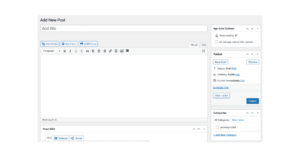
The first way is to go up to the black bar at the top of your site and click + New and scroll down to Post.
The second way is to navigate to Dashboard > Posts > Add New This path is also the path you take if you wanted to view All your Posts are Categories.
Once navigated into the post creation page, you will want to title your post and make sure you select a category (which we’ll go over in the next section).
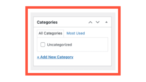
Adding a Category
Categories are helpful for a couple reasons.
They are both searchable + sortable.
Similar to making a post, making a category has two options ::
You can choose a to add a category directly from the post. Simply navigate to the right side of the post creation page and you will have the option to + Add New Category
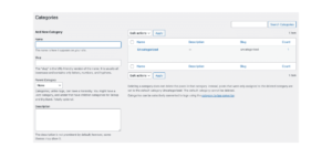
Or you can navigate from the Dashboard > Posts > Categories If navigating through the dashboard, you will have the option to add more information to your categories (IE the slug, and a detailed description)


